Visualize Tab
This section introduces each feature of the Visualize Tab.
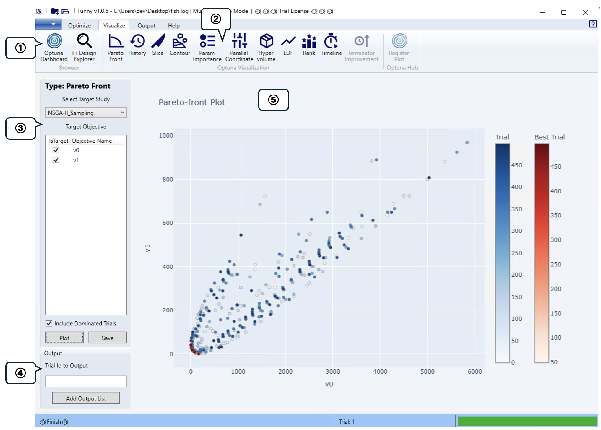
① Browser Group
The optimization results are displayed in an analysis tool that runs in a browser. Tunny supports two analysis tools.
For Optuna-Dashboard's LLM integration features, please refer to the official documentation. API settings required for LLM integration can be configured through the Result File settings in Tunny.
② Optuna Visualization Group
Visualize optimization results using Optuna's visualization features. Support is available for the following: The same visualizations can also be viewed in Optuna-Dashboard.
- Pareto Front
- Optimization History
- Slice
- Contour
- Hyperparameter Importance
- EDF
- Rank
- Timeline
③ Plot Settings
Configures graph rendering settings when selecting an Optuna Visualization Group. As a representative example, we'll introduce the Pareto Front plot.
- Select Target Study
- Select the name of the Study to plot.
- Target Objective
- Select the objective function to be plotted. You can select two or three for the ParetoFront plot.
- Include Dominated Trials
- If checked, individuals not on the Pareto front will also be plotted.
- Plot & Save Buttons
- Click the Plot button to display a graph in the Plot Area.
- Click the Save button to save the graph in HTML format. Since saving in HTML format allows you to view the graph interactively later, you can review the figure at any time.
④ Output Setting
Enter the trial number to display when hovering over a graph point, then click "Add Output List" to add it to the output target list configured in the Output tab.
⑤ Plot Area
Plots created in Plot Settings will be rendered. Note that rendering may take some time.
The graph allows interactive zooming, scaling, and panning using the mouse.
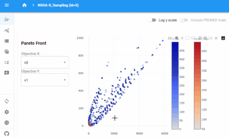
Open Optuna-Dashboard
An analysis tool for optimizing results that runs directly in your browser. Below are examples of its functionality: